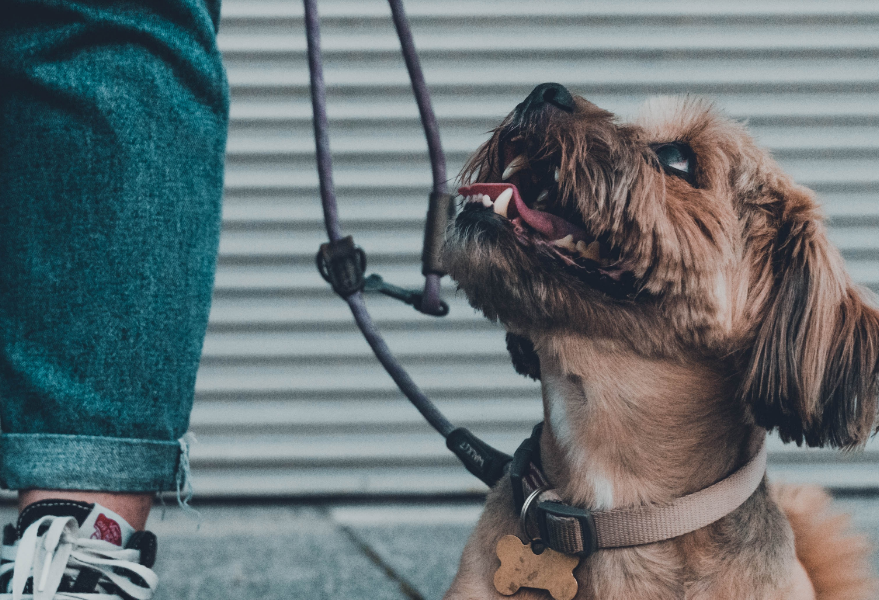
Furry Fitness
As part of my Google UX Professional certificate, I undertook a meaningful project focused on developing an application for a social cause: walking dogs from shelters.
This comprehensive endeavor encompassed the entire UX journey, encompassing app and responsive web design development.
KEYWORDS: research, benchmarking, personas, ideation, adobe xd, wireframes, usability study, design refining, mockups, sitemap, responsive web
Project Overview
My Role
UX designer leading development of app and responsive website
Responsibilities:
Conducting interviews, paper and digital wireframing, low and high-fidelity prototyping, conducting usability studies, translation, iterating of design, information architecture
About Project
We are creating a new application for a shelter for abandoned animals. The goal of the application is to make it easier for volunteers to arrange a meeting for walking and socializing with animals, which helps their recreation as well as the animals in the shelter.
The goal of the application is to increase the number of volunteers, and ultimately the number of animal adoptions.
The project starts with the creation of the design for the App, and the second part of the project is the responsive web design
Challenge
The Problem
In shelters dedicated to abandoned animals, numerous furry companions eagerly await loving homes, hoping for a chance to bring joy and companionship into the lives of caring individuals
The Goal
In order to increase the possibilities for adoption, but also to benefit from the interaction of animals with other people, and to increase the activity of citizens, I created an application and a website for booking appointments for dog walks from shelters
The Research
About
As part of my research, I employed a comprehensive approach that involved both desk research techniques, such as competitive benchmarking, as well as persona development, to gain a deep understanding of their pain points and challenges
Competitive Benchmarking
During competitive benchmarking, I analyzed about 10 similar websites, including direct competitors like Petfinder by Purina and indirect competitors like dog adoption shelters. These sites were categorized into Features, User Experience, and Customer Satisfaction.
Features: I evaluated the functionalities offered by each website, such as search filters, adoption applications, pet profiles, social media integration, and online donations. Unique features or services that set them apart from others in the market were also considered.
User Experience: The focus was on assessing usability, accessibility, layout, navigation, responsiveness, visual design, mobile optimization, user interfaces, and information clarity. The goal was to determine the user-friendliness and engagement of each website.
Customer Satisfaction: The aim was to gauge user satisfaction by examining reviews, ratings, testimonials, and social media feedback. Understanding users’ experiences and opinions helped identify competitors’ strengths and weaknesses in customer service and support.
Key Insights
Utilization of Personality-driven Profiles: Many websites and apps in the analyzed space employ profile structures reminiscent of social networks, which effectively showcase the unique personalities of dogs. This approach allows users to connect with individual dogs on a more personal level, enhancing the adoption experience and facilitating meaningful connections between potential adopters and pets.
Non-linear Paths and Donation Calls: While some websites may lack a linear user flow, it’s important to note that these sites often utilize advertisements and donation calls strategically throughout their pages. While these elements may be perceived as interruptions, they play a vital role in generating crucial funds for shelters and rescue organizations. Balancing these elements with user experience considerations is essential for ensuring a harmonious browsing experience.
Strong User Feedback and Community Building: Users of these websites actively engage and provide positive feedback, fostering a vibrant and supportive community. The interactive nature of these platforms enables users to share their experiences, stories, and pictures, creating a sense of belonging and camaraderie among fellow pet lovers. This strong community engagement can contribute to increased user satisfaction and loyalty.
Personas
I built these personas for the dog walking app to understand the diverse needs and preferences of potential users. By creating personas like Philip and Maria, we can tailor the app’s features and services to cater to their specific requirements.
These personas serve as a valuable reference point throughout the development process, ensuring that the dog walking app caters to a wide range of users and their specific circumstances.
By understanding and addressing the needs of users like Philip and Maria, we can provide a user-friendly and personalized experience that encourages engagement with shelter animals while accommodating different lifestyles and time constraints.
Ideation
About
To generate ideas for the dog walking app, I employed the Crazy 8 exercise, a creative brainstorming technique. During this exercise, I sketched numerous screens, beginning with the homepage, to establish the desired user flow. The main objective was to create an intuitive and engaging experience that prioritizes visibility for shelter animals while effectively communicating the context and purpose of the project, starting from the landing page.
By utilizing the Crazy 8 exercise, I was able to explore a wide range of design possibilities and iterate on various screen layouts. This exercise allowed me to generate innovative ideas for the app’s interface, ensuring that it aligns with the project’s objectives and delivers an appealing user experience. The sketched screens serve as a visual representation of the envisioned flow, aiding in the development of a cohesive and user-friendly design.
Starting the Design
App Wireframes
The primary objective was to develop a specialized application tailored exclusively for dog walkers. This application focuses on providing concise and essential information while streamlining the booking process. Unlike the website counterpart, the app offers a limited range of features to ensure a seamless experience for users in need of information and booking services.
Prototype / Design Tested
To get ready for usability testing, I made a basic prototype. It’s a simple version that helps me gather feedback and insights early on. By doing this, I can spot any issues, make changes faster, and improve the design based on user input.
This preparation makes the usability testing process smoother and helps create a user-friendly final product.
Link and Usability Task
Link: Explore Lo-Fi prototype
Task: Book your walking time with Mike the dog and return to the homepage
Parameters
Study type: Moderated usability study
Location: Denmark, in person
Participants: 5 participants
Length: 10 minutes
App Usability Study: Findings
1
The users were unaware that there was additional content beyond the button on a particular pet page, and the arrangement of the content did not align with the information’s hierarchical structure
2
To enhance the user experience, it is recommended to remove the search option and the “PETS” button as they are unnecessary. Instead, the flow of the application should guide users to choose animals that have been with the volunteers for the least amount of time, prioritizing those in need of attention and walk
3
The page had an excessive use of various fonts, which negatively impacted the overall design aesthetics. Furthermore, there was a lack of adequate white space around the text and between different sections, causing a cluttered appearance
Refining the
App Design
About
After conducting a usability test, valuable insights were gained. To refine the design, necessary adjustments will be made based on user feedback. This iterative process aims to enhance usability, optimize visual elements, and improve overall user experience, ensuring a more intuitive and satisfying interaction with the product.
Finding 1
P0 priority
Participant quote:
” I didn’t know I could scroll!”
Solution:
I have created a layout that implies the presence of additional content and organizes the existing content in a more structured manner, prioritizing its importance
Finding 2
P1 priority
Participant quote:
“What will I look for with the search option?”
Solution:
I have made some changes to the design of the page. I removed the search icon and the “Pets” button. The reason for removing the “Pets” button is that it was causing confusion among users. As for the search icon, we decided to remove it because our primary focus is to highlight the dogs that were most recently walked. By removing the search functionality, we can draw immediate attention to these dogs
Finding 3
P2 priority
Participant quote:
“Why so many font styles?”
Solution:
In terms of design, I received feedback regarding the use of multiple typography styles, which could be overwhelming for users. To address this concern, I deliberately chose two distinct fonts: one for the body text to ensure readability, and another for the headers to enhance the visual appeal of the page. The purpose behind this approach was to create a visually attractive layout while maintaining optimal readability for the users.
App High-Fidelity
Prototype
About
The high-fidelity prototype followed the same user flow as the low-fidelity prototype, including changes after the usability study
Link: Explore Hi-Fi Prototype
Task: Book your walking time with Bella the dog and return to the homepage
App Sitemap
For the App, I opted for a streamlined linear website structure specifically designed for booking purposes. In contrast to the responsive website, the mobile app features a dedicated infrastructure exclusively tailored for booking dog tours
Responsive Web Design
About
The second part of the project involves the development of a website that serves a different purpose than the mobile app.
Throughout this phase of the project, I also conducted testing and iteration to ensure the desired outcome was achieved.
Design Desktop
While the app is primarily focused on booking and planning dog walks, the website serves as a general informational platform about the project. To achieve this, I created five distinct pages, each dedicated to specific content.
Links:
Design Mobile
While the app is primarily focused on booking and planning dog walks, the website serves as a general informational platform about the project. To achieve this, I created five distinct pages, each dedicated to specific content.
Links:
Next Steps
1
Expanding the high-fidelity prototype with more pages enhances user flow, showcases features, gathers feedback, and refines the overall experience
2
Perform comprehensive user flow tests to assess and enhance updates, ensuring a smooth and intuitive user experience, ultimately improving product outcomes
Conclusion
In this project, I aimed to design a mobile app facilitating dog selection and information, alongside a responsive web page.
The mobile app focused on user registration and dog selection, while the web page consisted of a desktop design for five project pages.
For the mobile design, I incorporated an animated burger menu transition.
The project encompassed research, ideation, wireframing, and the development of a high-fidelity prototype.
Other Projects


Let's Innovate and Create
Don’t hesitate to reach out—I’m just a click away. Let’s connect and make great things happen!